Antonio Topete
When I hear a song that I know, maybe before I think of the song name, or artist, or can recall any other information about it, the first thing that pops into my mind is an image of its album art. Often, the only thing I can remember at all is the art from the one time that I listened to the song or album. And for music that I truly love, the image of the artwork is seared into my memory, inseparable. There’s something so memorable about images, even in music, which is obviously a medium that requires no visuals at all. And yet the institution of having album art has become so engrained in music, even as we’ve moved into the digital age of music listening. In my (likely uncontroversial) opinion, this is a perfect union. In so many ways, music is evocative of emotions, stories, and images. Be it through picturesque lyrics, or deeply expressive sound, music finds its way to manifest in visual thoughts. To then supplement this music with an image, and to do it well, can add new layers to the experience of enjoying music. I certainly think so.
The album cover is born from the need to commercialize music. It’s difficult to sell a collection of sounds on a vinyl record without giving the consumer something to distinguish it with and absorb information from. Something about a wall of blank, black discs doesn’t spark much interest, unfortunately. As a result, of course, most early artwork aimed to resolve this problem very directly. Album sleeves were decorated with practical information: what is the album name? Who is the artist? What is the record label? What does the artist look like? Browsing old albums at a vintage record shop, you might find paging through the shelves feels more like looking at a strangely bold and fashionable photo album, rather than a collection of music. Images of people playing their guitars on stage, or a group of young faces, light smiles staring out toward you, and bold, uniform typeface that reads something like “John Johnson And His Jazz Band Presents: Johnny Jams”. Flipping through a number of these, I find my intrigue quickly turns to boredom, and at times, frustration. The ability to add expression, personality, and distinction to an album is boundless in artwork, and is something that should always be used to communicate a message about the music that adds value to the work as a whole. But once you start flipping through albums of the late 60’s, you will start to see an increasing shift. To illustrate this, we could look at one of the most prominent examples of this shift, The Beatles.

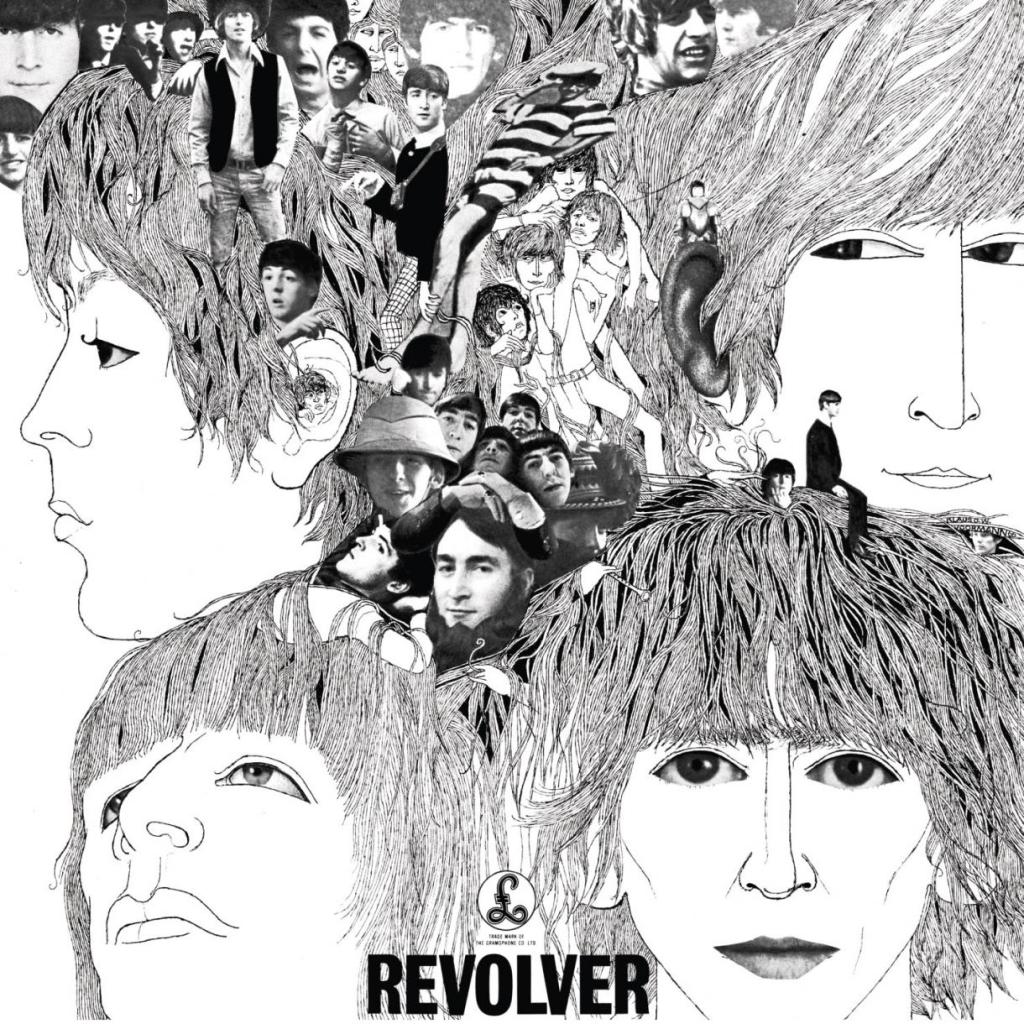
Although only 3 years apart, Please Please Me and Revolver are separated by a great divide musically and stylistically, which is reflected in their album art. The former fits the description above, having a very utilitarian approach to presenting its information. Boldly we can read who these 4 smiling boys above us are, and what they will be playing for us in this album. It’s basic, and it’s boring. Revolver is immediately expressive, showing an increasing penchant for the experimental, and demonstrating a clear sense of identity as artists. The four band members are illustrated in large abstractions, surrounded by other versions of themselves, reflective perhaps of the growing kaleidoscopic nature of their music, which would continue to develop in their following work. When comparing these two albums, without even knowing what music is inside, I am sure that I would be drawn to reach for Revolver every time. People always say “don’t judge a book by its cover.” I would argue that missing the opportunity to use a cover creatively and expressively says quite a bit about the artist, and making judgments on that is actually quite valid.
One album that comes to mind which embraces the intrigue of the unknown with its album art is Since I Left You by The Avalanches. I remember seeing this album for the first time and being truly captivated by it, and soon after being captivated by the music within.

Since I Left You is a groundbreaking album built entirely on samples. With over 3500 sampled sounds, the album is a testament to creatively reimagining the sounds, and the world, around us. An abundance of these samples are very obscure, originating from forgotten music, television ads, instructional videos and audio, and in some instances, unknown origins. These samples are put together in a beautiful way that creates new meaning and context for them, while creating a sound that is completely new and entrancing. The album art is just the same, although the origins of this artwork are not widely known (the original painting is here), the image has been modified to feel like something familiar and beautiful, like a painting you’ve seen dozens of times before, that is still completely new. This familiar feeling translates perfectly from the deeply nostalgic sound heard throughout the album. The blend of colors, the light wear on the paint, and the look of floating on the open ocean all play into my emotional connection to this work, and amplifies the tone of the music perfectly.
As time has gone on, album art has been used expressively and creatively by artists across the board, often even forgoing basic information like the artist’s name or the album title, in favor of using the full space of the album art for evocative imagery. In the digital age especially, the need for text on album art is becoming less and less of a requirement. One such album that fully embraces the space of the album cover is Titanic Rising by Weyes Blood.

The entire cover is filled with this stunning photograph of Natalie Mering, also known as Weyes Blood, in this fantastical underwater bedroom. The image is truly beautiful, and much like Since I Left You, is expressive of nostalgic feelings echoed in the music, although achieved in a very different way. The opening track of the album, “A Lot’s Gonna Change” sets the stage for the emotional space it inhabits, reflecting on getting older, lamenting the loss of innocence, both in seeing changes in the world such as environmental peril, as well as experiencing the heartbreak of lost relationships that come with adulthood. This loss is shown perfectly on the album art. There Natalie is, in what could be her childhood bedroom, teddy bear on an old twin bed, posters and pictures hung on the walls. The room is brimming with the feeling of being young, but in this memory she is drowning in the water that has consumed the space, almost as though to say that these feelings of nostalgia cannot be lived in, and shouldn’t. And as Natalie looks out at us, it is evident she wants to stay in the familiarity and safety of the space, but in rather heartbreaking fashion, we know the rising water won’t let her.
In both Since I Left You and Titanic Rising, the album art is a meditated decision, carefully thought out and adding value to the work. In both cases, the art is an emotional supplement to the music, mirroring what is felt throughout the album. And this is exactly how it should be. Of course, there are fantastic albums with underwhelming or unremarkable album art, and at the end of the day good music can always speak for itself. But there’s a special joy in listening to a record and staring at the beautiful artwork, dissecting its details, and making emotional connections between sight and sound. If you haven’t already, think of some of your favorite albums, and think about their album art, and what it means to the music inside, and what it means to you. Don’t be afraid to judge them by their cover.
